Over the past 10-15 years, modern smartphones have reshaped how we navigate through websites. Through clever technologies and navigation updates, browsing the web in a mobile experience transitioned well enough where mobile accounted for the majority share in worldwide web traffic in 2017. (reference) Dashboard reporting, on the other hand, strictly remains a desktop experience. The ability to analyze, report, and observe your data requires real-estate in screen size, which mobile simply does not have. Of course, there are mobile dashboards that have been released, some of which are provided through analytics platforms both big and small. However, the limitations in screen size can result in either of the two obstacles:
The UI is limited where the data is too basic and high level
Navigation is too confusing to find what’s important
Either way, both obstacles can translate to the same problem: “I cannot easily find data that’s important to me.“How Can Mobile Dashboards Be More Effective?Below are some concrete ideas in tackling this question. While each client is unique in how they evaluate success, these ideas mentioned below should always be explored. This can be achieved through report building editors like Google Data Studio and Tableau.Separate Your ExperiencesTrying to make a single dashboard experience that serves both mobile and desktop has tradeoffs and severe compromises. Instead, create two separate dashboards that are designed for their strengths. Desktop can play to its usual advantages, which typically can involve a deeper level of analysis. At times, desktop dashboards are served as data exports for clients to use in a series of other reports they may need. With a demand to get data for action-oriented objectives, desktop has served, and will continue to serve, that purpose very well.For Web Analytics reporting, mobile is not yet designed to achieve that same level of ease and usability as desktop. With that in mind, mobile does have an advantage with simplicity and accessibility. Despite a need for heavy level-analysis, there is also frequent demand to know certain key performance indicators that mobile can easily serve.Simplicity and PersonalizationWith limitations to screen size, the dashboard needs to be designed with simplicity in mind. The idea shouldn’t be about doing an ad-hoc analysis via mobile. For example, try to limit the number of drop-down filters in your mobile report. The only manually inputted filter that should exist is your calendar. (screenshot provided) With simplicity replacing complexity, your mobile dashboard should be about getting the easiest access to questions you frequently want answers to. That’s where personalization for mobile is key. These can range from anything like the following:
What was my return on ad spend yesterday?
How many forms did my customers fill out online?
What is my current Cost-Per-Acquisition?
How much revenue have I generated thus far from my website?
If these are questions that matter to you on a daily basis, a mobile dashboard report can serve its purpose in being quick and accessible while on the go.Lastly: Rule of Thumb on DesignAs mentioned regarding simplicity, it’s important to understand how graphs and tables are presented in a mobile experience. It is essential to have your data be readable and understandable. Below is an example of this:. Left: Simplistic, Right: ComplexIn the case of mobile dashboards, less is more. If you feel the need for multiple stats and dimensions with your data, Desktop would be the recommendation for that experience. As you build out your dashboard, always test to see how it will appear on your smartphone.As a takeaway from all of these ideas: Even though mobile is still figuring out its place in web analytics reporting, we now have the proper tools today to better make your customized dashboard report.
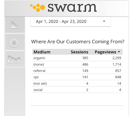
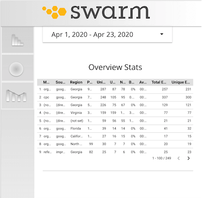
SCS UNITES WITH SWARM – A DIGITAL PERFORMANCE AGENCY, TO ADD MORE FOCUS ON RESULTS
Together as SCS, the new union will include 100 people across three offices – Atlanta, Southern California, and Ottawa (Canada) – and offer an integrated digital, media, creative and marketing consultancy designed as a modern, agile-solution at scale for national and international brand management.

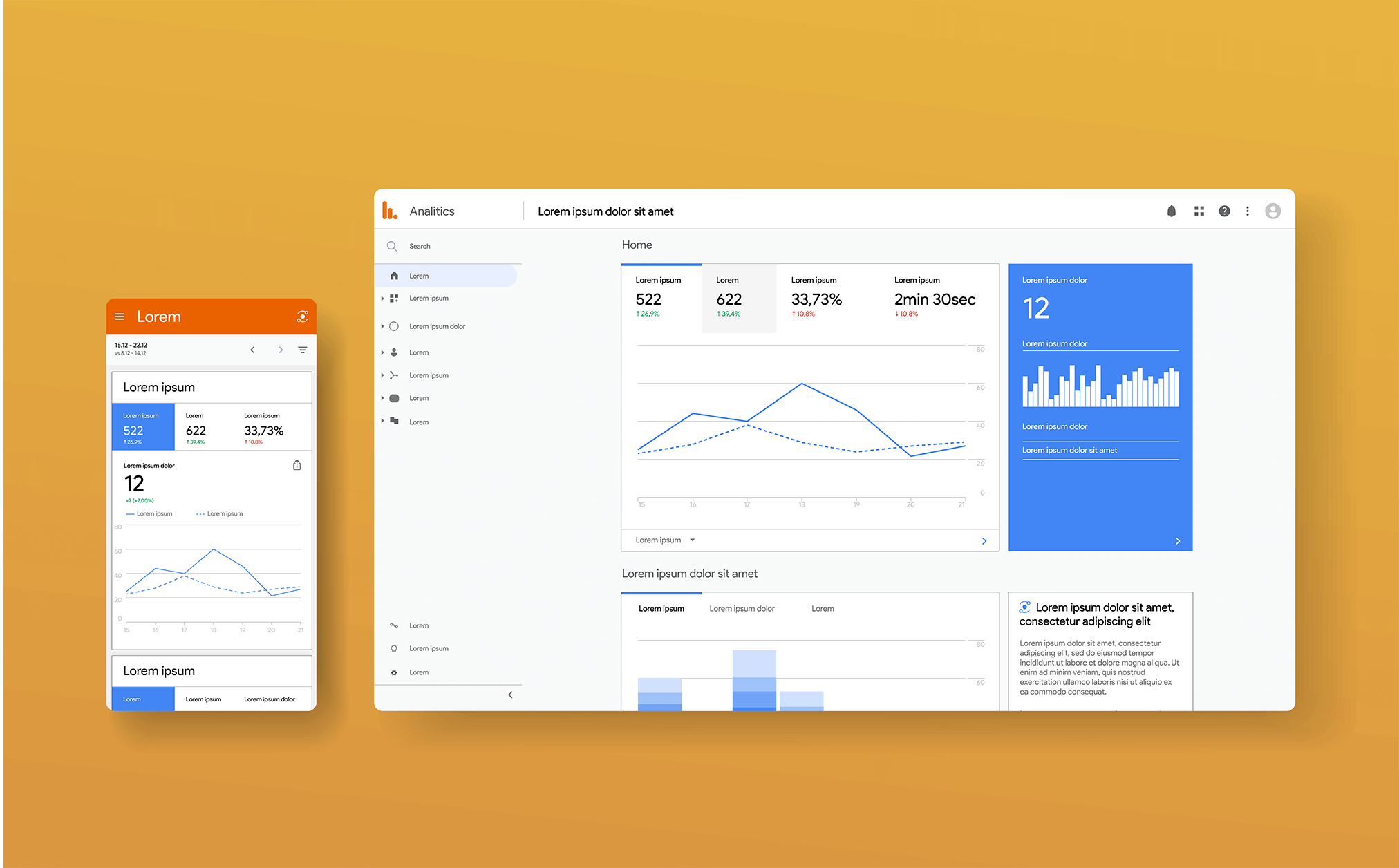
 Left: Simplistic, Right: Complex
In the case of mobile dashboards, less is more. If you feel the need for multiple stats and dimensions with your data, Desktop would be the recommendation for that experience. As you build out your dashboard, always test to see how it will appear on your smartphone.
As a takeaway from all of these ideas: Even though mobile is still figuring out its place in web analytics reporting, we now have the proper tools today to better make your customized dashboard report.
Left: Simplistic, Right: Complex
In the case of mobile dashboards, less is more. If you feel the need for multiple stats and dimensions with your data, Desktop would be the recommendation for that experience. As you build out your dashboard, always test to see how it will appear on your smartphone.
As a takeaway from all of these ideas: Even though mobile is still figuring out its place in web analytics reporting, we now have the proper tools today to better make your customized dashboard report. 