What is Visual Hierarchy?
Visual Hierarchy is the arrangement or presentation of information or elements in order of importance. It is a simple enough concept and is backed by real science. The >Gestalt Psychological Theory is the theory that the human brain has innate organizing tendencies, and it is hugely important to marketers.
Why should you care?
It’s probably not a surprise to you that most individuals have an attention span of 8 seconds. Without organizing the information in a logical way for your consumer to quickly sift through, they may tend to become annoyed and confused. As the saying goes, “a confused consumer says, ‘no’.” People are fickle by nature and they rely on visuals to influence the split- second purchase decision. If there is a ton of information, the likelihood your consumer is reading it is slim-to-none. It’s the harsh truth, but people are inherently visual thinkers and not data processors. That’s okay though because an informed marketer can use this to his/her advantage.
What can you do?
In this world of overstimulation, marketers and designers can create a user experience for their websites and apps that uses the fundamentals of visual hierarchy to deliver their message in the most concise way. Websites that are intuitive, easy-to-use, and have a strong visual hierarchy make it easy for not only your impulse buyers, but for your more deliberate consumers to make an easy and informed purchase.
What are some of the fundamentals of Visual Hierarchy & Design?
The main contributors of visual hierarchy are: size and scale, color and contrast, negative space/ whitespace, and, my favorite, typography.
Size & Scale.
These are some of the most powerful of the tools. The size you make certain elements of information on your website, in comparison to the other elements, communicates how important that information is to your audience. Look at the example below of the 2 hexagons. Chances are you don’t view them as a group of 2 hexagons, but instead 1 yellow and 1 smaller gray one.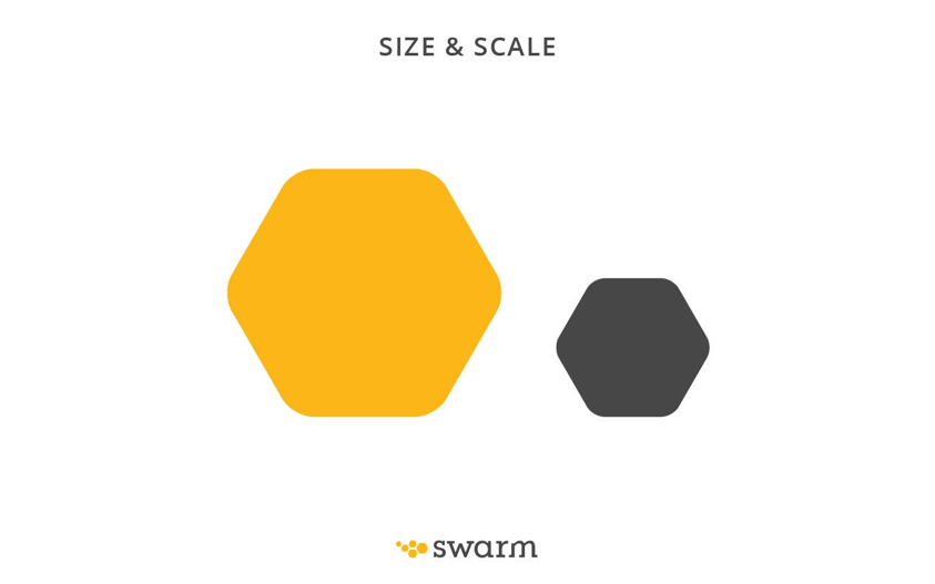
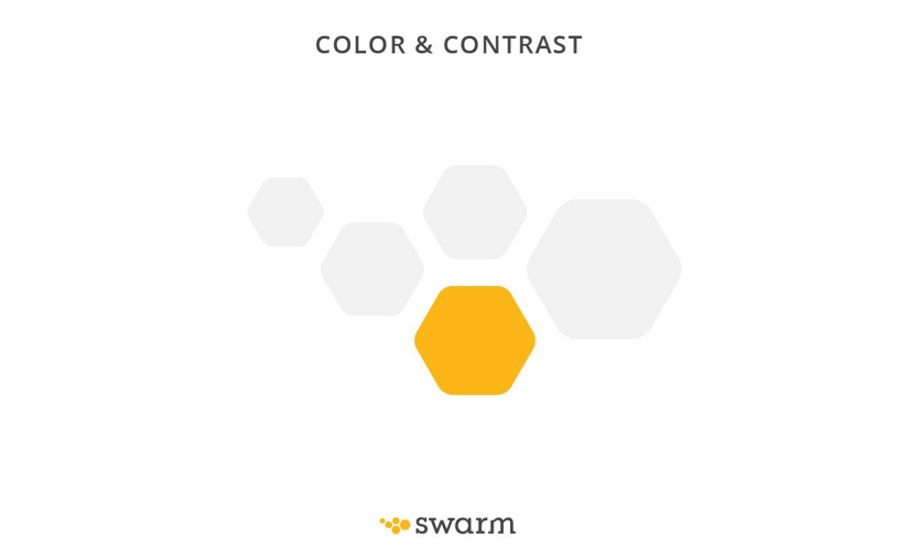
Color & Contrast.
The overall the
goal is to create interest. It may seem obvious that bright colors stand out from muted colors, but color
can
also be crucial with leading a viewer’s eye to an important CTA. (see example
below)
Additionally, Color Theory is real and it can set the whole mood for your
site.
Example: Blues are typically seen as soothing while reds and orange are generally viewed as
aggressive.
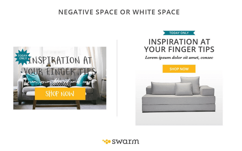
Negative Space or White Space.
While this isn’t always a marketer’s favorite design element because websites are often viewed as expensive real estate, a designer loves this design feature. Highly dense elements can create clutter and create a space that feels heavy and uninviting. Not a feeling you want a potential buyer to feel. In the same token, if a space has too much room, the relationship of the elements within the space can get lost. Similar to Goldilocks, you have to create a design that is ‘just right’, minimizing clutter and guiding your eye from one element to the other to accurately portray your story in the quickest manner possible.
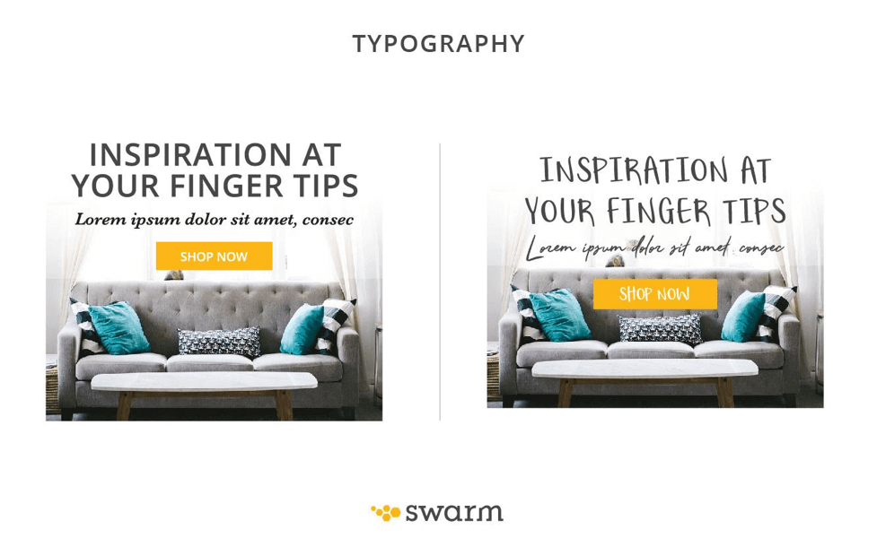
Typography
Lastly, we can’t forget about Typography. Just as size and color are important, font type, style, and weight can make a huge difference. There should always be an established plan for size and weight of each: primary, secondary, and tertiary copy when creating a website. Meaning that your headlines should always stand out from your sub heads and your sub heads from your body copy. More importantly, be conscious of your audience when selecting a typeface. Some fonts are feminine, or masculine or even youthful. If you are selling to predominantly men, you probably want to stay away from a dainty script font. Additionally, some youthful fonts, if not used properly, can scream a messy and disorganized brand.
In conclusion, when information and content is effectively organized, it creates a more trustworthy brand and speeds up the decision-making process by your customers. Strategically placed information and visual elements using neurological triggers can perfectly communicate your goals as a business ultimately increasing your conversion rates and who doesn’t want that?!