
The apocalypse is here! Wait, no. It’s just Google’s mobile algorithm update. But instead of asteroids hitting our planet, it’s Google search bots that are hitting your website. With this update, named #Mobilegeddon by many, Google has expanded its ever growing and changing list of ranking factors to include mobile-friendliness. We at Swarm are always watching out for hints of Google’s next algorithm change, but this time, Google announced the exact date and expected result of the change, which never happens!
So, what does this update mean and what can you do?
Well, starting April 21st and over the next few weeks, website pages that have good mobile usability will get a ranking boost in Google’s mobile search results and those that do not will be pushed down. So, what can YOU do to make sure your website is aptly doomsday prepped? Not to fear! Here’s a handy list of what you can do right away to survive the #Mobilegeddon threat.
1. See how your pages look in Google’s mobile search results
First and foremost, check to see if you are even at risk for being targeted. Luckily, there are some simple ways to see if your site and its pages are mobile friendly.
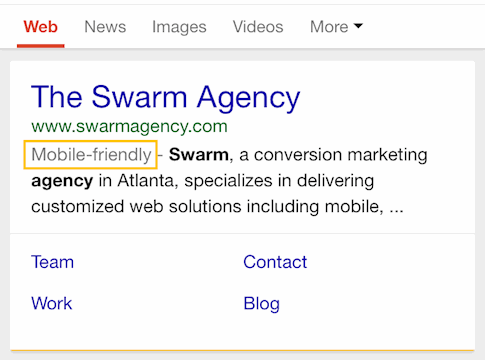
Mobile-Friendly Search Results Tag – Look for Google’s mobile-friendly tag in search results on your mobile phone. If you perform a mobile search for your site and its pages, does it have gray text in the snippet that says “Mobile-friendly?” See if it does. If so, no need to worry.
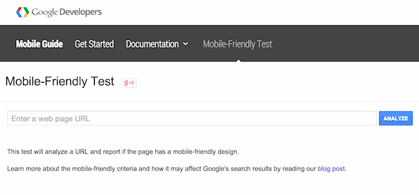
2. Test your site and pages using Google’s Mobile Testing Tool
Google’s Mobile Testing Tool – Use Google’s mobile testing tool to test in realtime if your site and its pages are mobile friendly. Google will tell you if the page is simply mobile-friendly or not. There is no gray area. After analysis is complete, see what parts of the page need to be fixed for it to be mobile-friendly and get a screenshot of what Google actually sees on a mobile device.
3. Take a deeper look in Google Webmaster Tools if necessary
Google Webmaster Tools – Get insights for how your site appears in mobile using the Google Webmaster Tools’ mobile usability section. You’ll need a Google Webmaster Tools account for your site. This tool is located within the Search Traffic section and will report pages that are at risk of being deemed mobile-unfriendly as well as provide ways to fix the issues.
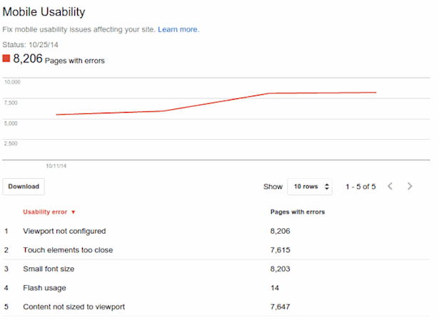
Credit: Google
Uh oh! So you have one or more pages on your site that are not mobile-friendly. What then?
Google Mobile Developers Site – Check out Google’s complete guide to mobile on the Google Developers website. Google has not only specified the ways in which it deems a site mobile-friendly, but it gives you tips and options for building an optimized mobile site that will perform well for users and in search results. For example, if you already have a site set up with a CMS like WordPress, Drupal or similar, you’ll want to make sure it is customized for mobile devices. And, if you are rebuilding your site to be mobile-friendly, you’ll want to choose a mobile site configuration according to Google’s guidelines. In addition, Google’s mobile guide has plenty of information on avoiding common mistakes, implementing mobile SEO best practices, advice for working with developers and more.
Once you’ve made your site pages mobile-friendly, keep testing and tracking how your site is viewed on mobile. Google and your users will thank you for it.
#Mobilegeddon or not, mobile search is here to stay. Use the tools above to see what you need to do to make sure your site is usable and optimized for mobile. And by using these simple tools, you can make sure that your site doesn’t fall during the apocalypse.. er.. Google’s mobile search update.