Just a short time ago, we wrote about the merging of two worlds: SEO & UX. We described how the SEO profession has moved its focus toward users rather than search engines. And we explained how and why UX design principles have become an essential part of organic search strategy. This could not be more relevant today.
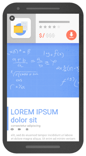
Take the issue of interstitial pop ups, which pop up over page content in order to show users deals and promotions, email signup form, or another call to action.

The user either interacts with this popup or closes out of it, often via a small “x” in the corner.
Google recently announced that mobile pages that show “intrusive” interstitials like the one above may be subject to algorithmic penalties and may not rank as highly in organic search results.
But why? And how do we at Swarm make sure our clients’ websites continue to have the best SEO and user experience? Our search strategist and graphic designer teamed up to give their take.
Jonathan Foulds, Search Strategist
This is a page-level penalty that will begin on January 10th for any mobile pages that users land on from search results that have a popup deemed “intrusive”. The purpose of this, says Google, is all about helping users find the content they are searching for. In search engines’ eyes, pages should not show highly in results if the content users are expected to find is all of a sudden hidden to them when they arrive. Although Google does give some examples of what “intrusive” interstitials are not acceptable, we know more specifically what forms of interstitials are in fact okay and will not invite any penalties:
- Interstitials asking the user to accept cookie usage
- Interstitials asking the user to verify their age
- Interstitials that use “a reasonable amount of screen space”.
An example of the last one would be a small banner at the top of the mobile page.

To continue to perform well in search, sites that have mobile pages with interstitial pop ups should immediately review and consider alternatives like the ones above.
Anna Smith, Graphic Designer
Understanding the SEO implications of mobile interstitials is only half of the story. Another component is the experience of the user. We’ve all been there, scrolling along when suddenly we are hit with a full screen pop up out of nowhere. It is much like being in the middle of a sentence when someone randomly interrupts you with a completely unrelated thought. Your train of thought is thrown off.
User experience is all about advocating on behalf of users. This means making sure users find, and see, what they want in an easy, fluid fashion. Mobile design has always presented unique UX challenges. The mobile screen is significantly smaller than desktop, so real estate is prime. Covering this valuable space with a confusing pop-up creates friction with your user. Many interstitials must be exited by the user via a tiny “X” or some buried opt-out text. On a mobile device, these elements are already smaller than usual, and sometimes incorporated in unfamiliar UI patterns. This leads to a frustrating first encounter for a user.
These pop-ups are also visually jarring at times. Have you ever started to read about a great recipe when you are hit with a full screen pop up about a newsletter? The lack of consistency in images and message can be off-putting for users.
Taking users out of their context always leads to trouble. As a designer, I am looking forward to less annoying pop-ups, and more time spent actually seeing the content I am seeking.
Let us know what you think on Facebook!
